20 Best Websites for Cleaning Services: Our Ratings for 2023
We show you what we like about these cleaning websites and what we would improve. Then, we give you our top strategies to get more leads out of your website.
By Jane Pardo | Updated December 26, 2023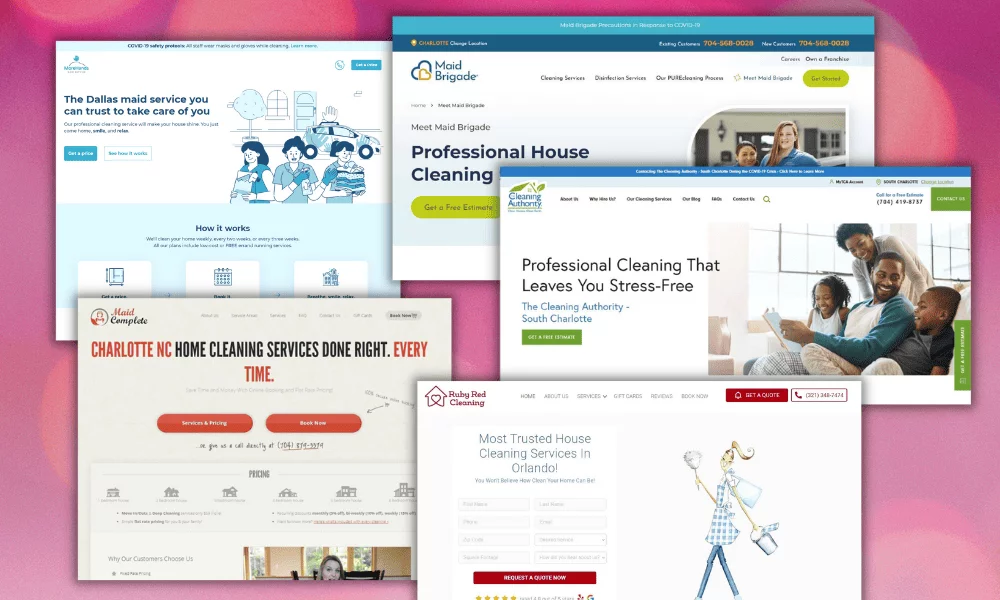
What are the qualities of the best cleaning company websites? A website’s performance is usually measured by its conversion rate. Conversion rate refers to the percentage of website visitors that convert into a lead for the business.
We’ve analyzed 20 of the best cleaning services website examples we found on the web and reviewed their qualities based on best practices for conversion rate optimization.
We also gave them a score from 1 to 10, with 10 being the best score. And we commented on each one regarding opportunities for improvement.
1. morehands.com
Score: 10/10

What we like
- Great call-to-actions: They use a “Get a price” button on the header and a larger version on the hero section below the headings. They use secondary call-to-actions next to each primary call-to-action. Perfectly done.
- Beautiful animated illustrations. See that cool illustration? It’s actually animated when you visit the website. Very cool!
- Beautiful overall design: From the layout to the perfectly matched icons on the “How it works” section, this design was thoughtfully made in every way.
What could be improved
- The color palette may just be too clean. Adding something other than blue can give the design more life. We would try using a completely different color for the call-to-actions to make them stand out more.
2. maidbrigade.com
Score: 9/10

What we like
- Perfect call-to-actions. The header has a well-placed “Get Started” button and the hero section has a large “Get a Free Estimate” button, helping the visitor know exactly what to do to move forward.
- The design is true to brand: Notice the logo’s round shapes (the heart), they continue this theme in their round buttons, rounded image border, and typography selection.
What could be improved
- The heading is very generic, they could use more engaging writing to capture the reader’s attention.
3. maidcomplete.com
Score: 9/10

What we like
- Unique design: This website definitely stands out and in a very good way. The design is also true to brand by capturing a more retro look and feel.
- Great call-to-actions: The “Book Now” button on the header stands out from the other links and the two round buttons below the heading definitely help the visitor move forward. The use of a handwritten style script next to the buttons adds a personal touch to give more information.
- A pricing chart: This will keep visitors on the page and answer their questions without wasting time.
What could be improved
- Typography Colors: Notice how hard it is to read the gray subheading between the main heading and the red buttons. Then, they continue to use a light-colored font on the pricing chart with not high enough contrast with the background colors.
4. rubyredcleaning.com
Score: 9/10

What we like
- Great call-to-actions. The header features a “Get a Quote” button as the primary call-to-action and a phone number as the secondary call-to-action. The hero section features a form with the submit button being the primary call-to-action.
- Average rating. Placing the ratings and the Google and Yelp icons below the submit button can help the visitor feel more confident about their decision to move forward.
- Beautiful illustration: This website stands out thanks to its lovely custom illustration on a simple gray background.
What could be improved
- The form does not pass accessibility guidelines due to not having labels. They do use placeholders but placeholders are not a replacement for labels.
5. thecleaningauthority.com
Score: 9/10

What we like
- Great call-to-actions. They feature a green call-to-action button on the header and another green call-to-action button on the hero section.
- The photo sells the dream. Here we see a family enjoying more time together after hiring a cleaning service.
What could be improved
- Unnecessary sideways call-to-action. They place a floating call-to-action on the right side of the website instead of making the header “sticky” (fixed-position). This can reduce conversion rate compared to using a sticky header.
6. atlantagreenmaids.com
Score: 9/10

What we like
- Clear call to action: The orange book now button on the header and the form on the hero section make it easy for cleaning leads to get in touch quickly.
- Fast onboarding: potential customers can see pricing right away and book a service with ease.
- Great hero image: The best images show the experience the customer will get after buying. Here we see a mother spending more time with her daughter thanks to the time saved by hiring cleaners. This image is perfectly aligned to their heading.
What could be improved
- Typography: The use of all caps makes the text harder to read.
7. merrymaids.com
Score: 9/10

What we like
- Clear call-to-actions. They use a nice “Request an Estimate” button on the header and a larger button on the hero. They also use a phone number as a secondary call-to-action and even a link to “Text Us”.
- The photo sells the dream: We see a mother and daughter with more time on their hands after hiring a cleaning service.
What could be improved
- Too many navigation links make it harder to make a decision.
- Heading placement. Headings are typically placed on the left or center of the screen, placing them in these familiar areas increases trust and usability because people like what they are familiar with.
8. mollymaid.com
Score: 8/10

What we like
- Great call-to-actions. They use a pink “Request a Free Estimate” button on the header as well as a phone number as the secondary call-to-action. They use the primary call-to-action again on the hero section.
- Typography: Their typography matches the rest of their brand. Notice how its the same on the logo, headings, and vehicle wrap.
What could be improved
- The hero image is blurry which gives the website a less premium feel.
- Overcrowded header: There are too many options on the header, confusing the visitor and making it harder to make a decision.
9. maidtocleanorlando.com
Score: 8/10

What we like
- Great copywriting. Their heading and subheading is more creative and attention-grabbing than most generic cleaning websites.
- Great call-to-action on the hero section: The “New Customers Save $20” button is a great way to increase the conversion rate.
- The colors on the photo fit the brand: Notice how the blue house and green landscaping on the photo match the colors on the company’s logo.
What could be improved
- Blurry hero image: The image of the car they are using is not high resolution, giving the website a less premium feel.
- Uneven top header layout: Notice how the hours, service area, phone number, and logo are not aligned, this also creates a less professional feel on the website.
10. trustworthycleaningserv.com
Score: 8/10

What we like
- Use of video: Videos can keep your visitors engaged. Many visitors prefer watching a video than reading text.
- Use of coupon-styled discount boxes: Everyone loves a coupon.
- Social proof in the form of Google and Yelp ratings.
What could be improved
- There is no call to action in the hero section.
- Having the headline on the right of the page is an uncommon layout. Using unfamiliar layouts can decrease the conversion rate.
11. maidpro.com
Score: 8/10

What we like
- Zip code form. Zip code forms are a favorite for franchises because they work so well. It’s the first part of a multi-step form and they have a high conversion rate since it’s so easy to get started. Instead of overwhelming your visitor from the start with a long form, just ask for a zip code as a low commitment first step. After entering it, they are more likely to continue with the rest of the form.
What could be improved
- No clear call-to-action on the header. The closest thing to a call-to-action on the header is the phone number but it doesn’t stand out enough from the other elements.
12. modern-maids.com
Score: 8/10

What we like
- Great call-to-actions: The header uses a “Book Now” button as the primary call to action and a phone number as the secondary call to action. The hero section uses a form with a large “Schedule an Appointment” button as the primary call to action.
- Simple header: The header contains only a few links, helping to put attention on the call to action.
What could be improved
- The text is hard to read in the hero section: The white text against the light background makes it hard to read.
13. powderpuffmaids.com
Score: 7/10

What we like
- Easy price calculator: Customers love being able to see a price without having to call anyone. It also adds legitimacy to your business.
What could be improved
- Copywriting: The heading could be more engaging to capture the visitor’s attention.
- Social media link in the header: Instead of taking your traffic away from your website, we recommend placing a strong call-to-action button to increase conversion rate.
14. atlantacleaningsource.com
Score: 7/10

What we like
- Creative and attention-grabbing image: Everyone loves dogs. Just seeing a picture of a dog creates positive feelings and makes the website visitor feel at ease.
- Phone number and email easily accessible: Some people want to call or send an email. Displaying these contact channels on the header makes it easy for customers to get in touch.
- Unique selling proposition: They focus on their pet-friendly service to set them apart from the rest.
What could be improved
- There is no primary call to action.
- The header takes up too much space given the few items in it.
15. bigbangcleaningservicesinc.com
Score: 7/10

What we like
- Clean and modern header: The header is kept simple and easy to use, showing just the logo, navigation menu and the phone number as the call-to-action.
What could be improved
- Typography: The shadow on the text makes the design feel more old school. Using all-caps makes it harder to read.
- No call-to-action on the hero section. They use their phone number as the primary call to action on the header but don’t repeat it on the hero. Repeating the call to action here could perform better than showing unnecessary text like “Founded in 2010” and “Residential and Commercial”. They also repeat “Orlando Florida Cleaning Services” twice in the hero section.
16. theorganicmaids.com
Score: 7/10

What we like
- They list out their unique selling propositions in the hero section.
- Clear call-to-actions on the header.
What could be improved
- The second row of the header takes up too much vertical space.
- The angieslist awards make the hero section seem overcrowded. They could go right below the hero section.
- No call-to-action on the hero section.
17. fabulouscleaningservices.com
Score: 7/10

What we like
- The photo matches the color palette: Not just is the photo beautiful, but it’s also likely been edited to give it a pink overlay to match the brand’s color palette.
What could be improved
- Typography: We get it, cursive fonts look pretty, but they don’t make for the best reading experience. You can still find an elegant font that is also easy to read.
- No call to action in the hero section.
- The call to action on the header doesn’t stand out: They use a phone number on the header, they try to make it stand out by placing it away from the navigation menu and giving it an icon, but unfortunately, it still doesn’t catch your attention fast enough.
18. fiv5starhousecleaning.com
Score: 6/10

What we like
- Phone number on the header
- Immediate access to a contact form.
What could be improved
- There is no clear call-to-action
- The header’s second row (the pink row) takes up too much vertical space and it has too many links, making it harder for the visitor to make a decision.
- The photo is very generic and focuses on the service instead of “selling the dream”.
19. minthousecleaning.com
Score: 6/10

What we like
- Beautiful illustrations: They use a great-looking set of color-appropriate illustrations for each of their services.
- Simple header: They show few navigation links, reducing confusion and making it easier for the visitor to make a choice.
What could be improved
- No call-to-actions. A lack of call-to-actions generally has a large negative impact on conversion rates.
20. twomaidsandamop.com
Score: 6/10

What we like
- Video background: If you visit the website, you’ll see the background is actually a video. This makes the website more engaging and captures your visitor’s attention.
- Good copywriting: The headlines are engaging and unique, compared to the typical headlines used on most cleaning websites.
What could be improved
- Overcrowded header: Having so many links causes confusion and makes it harder to make a decision.
- No differentiation between primary call-to-actions and secondary call-to-actions. This makes it harder to know what to do when a visitor doesn’t have a lot of time on their hands.
Ideas for Cleaning Website Design

Include a Clear Call-to-Action Button.
A proper call-to-action (CTA) button is the first key element on your website. It serves as a signpost telling people what step to take next.
Do you want to entice prospects with a free quote? Then you could add a “Get a Quote” CTA button to draw attention. Or you could add a “Book Now” or “Call Us” button to encourage potential customers to contact you for professional cleaning.
Follow these steps to increase your conversion rates:
- Add a CTA button to the upper-right corner of your cleaning website.
- Create a sticky header so users always have immediate access to your call-to-action button. A sticky header ensures your website’s header remains visible in the same place even as people scroll down the page, allowing smooth navigation and easy access to functions like your services, contact page, homepage, and CTA.
- Include a larger call-to-action button on your website’s hero (intro) section and the final section before the footer, often referred to as the “final call-to-action.”
- Make sure your CTA button is always visible on mobile screens instead of hiding it in an offscreen menu.
Simplify Your Menu.
Cut the clutter on your website to help users focus on what matters the most. We recommend adding a maximum of five menu options to reduce clicks and speed up the sales process.
Presenting fewer options to visitors helps them make a decision faster. A complicated menu can immediately push people away from your cleaning website.
Here are some examples of the essential pages you can include in your cleaning company website design to encourage users to explore your site:
- About Us
- Our Services
- Contact Us
- Gallery/Portfolio
- Customer Reviews
- Careers
- Blog
If you’re offering different types of cleaning services, make sure you have distinct pages for each of them. For example:
- Residential/House Cleaning
- Commercial Contract Cleaning
- Post Construction Cleaning
- Apartment Cleaning Contracts
Hire a Professional Copywriter
A seasoned copywriter is your best bet if you want sales copy that’s captivating, optimized, and completely free of errors. The right copywriter understands a buyer’s journey and possesses the right skills and expertise to advertise your cleaning services.
Choose someone who has successfully created high-converting copy for cleaning websites. It’s a good idea to have the copy written first, making it easy for your web designers to tailor the design in a way that delivers the content thoughtfully and elegantly.
Fuse Brand Consistency Into Your Website Design.
Your brand tells a unique story that influences how people perceive your business and think about your services.
Build brand consistency throughout your cleaning business website design by following these tips:
Write Down Your Brand Attributes. Determine the distinct characteristics that define your brand’s culture, vision statement, and personality. Your customers will easily remember and connect with your brand if its attributes are easily identifiable.
Colors, shapes, and the overall look and feel of your brand will reflect your brand attributes and define a visual identity that attracts customers.
For example, innovation immediately comes to mind when we think of Tesla. The Apple brand is all about lifestyle, innovation, and creativity.
Use Visual Elements That Complement Your Brand Attributes. Are you an environmentally conscious company that highlights the use of eco-friendly products? Then greens and browns would feel earthy and look perfect for your web design.
Or you could be a cleaning company that boasts reliability and trustworthiness, which you can convey in calming shades of blue and white.
Apply shapes, textures, colors, images, and fonts that clearly reflect your brand attributes and make your cleaning business memorable to your target audience.
Use Beautiful Colors That Are Easy On the Eye.
The right colors can enhance the user experience and evoke emotions that encourage your visitors to take action. As mentioned earlier, your color palettes should be consistent with your branding.
Avoid bright, saturated backdrops that can strain the eyes. Go for simple color combinations that are pleasing to the eye.
You can use online color palette generators like coolors.co to experiment with various color palettes and explore trending hues. You can download Coolors on your iOS or Android device and integrate it with your Chrome browser or Adobe software.
Add Crisp, High-Quality Images.
Many websites get ruined by pictures that simply look out of place. Make your cleaning website look beautifully cohesive by using images with the right colors.
You want high-quality photos that complement your color palette.
For example, if you have a carpet cleaning company website with a blue-and-white color combination, find cleaning-related images showing these colors, like a cleaner wearing a blue cleaning outfit, using a blue vacuum, or wearing a blue cap.
You don’t want a messy assortment of glaring orange, purple, and yellow hues in those photos.
Pro Tip: Take clear photos of your cleaning crew at work instead of using bland stock images that don’t grab much attention.
Ensure Easy Readability.
Whether you’re creating a commercial cleaning website design or a house cleaning website, easy readability is a critical factor that can impact conversions.
A highly readable website means visitors find it easy to read and understand the site’s content. Readability depends on:
- Text Presentation: Colors, Spacing, Font Choice, Shapes, Alignment
- Context: Words on the Website
So, how do you make your cleaning website easily readable? Here are quick tips:
- Avoid center aligning your text. Left-aligned text is easier to read.
- Keep your text’s line length below 700px.
- Keep the spacing around your website’s elements consistent.
- Use optimal font sizes, preferably 17px or higher.
- Use a well-balanced color contrast to ensure all texts are visible.
- Write easy-to-digest content with headers and bullet points where necessary, so readers understand your message immediately at a glance.
Develop Your Website on WordPress.
WordPress is undoubtedly one of the most popular content management systems (CMS) worldwide. It’s a user-friendly platform that makes it easy for people to build websites and organize content.
We recommend using WordPress.org to develop your cleaning website to enjoy the ultimate freedom in managing your site. Website builders like Wix and Squarespace may work at first, but you’ll eventually outgrow them as you grow your cleaning business and require more complex website features.
Businesses of all sizes use WordPress because of the following major reasons:
- Flexible: You can explore thousands of free and premium themes that you can customize for your cleaning service website development.
- Saves Time: You can get your cleaning site up and running in just a few hours.
- Saves Money: Startup costs include hosting fees, a premium theme, a handful of plugins, and a domain name. Aside from that, you can save money in the long run as WordPress itself is free with lifetime upgrades.
- SEO-Friendly: WordPress streamlines SEO to help you attract more customers.
- Seamless Integrations: You’ll find unlimited third-party tools that automatically integrate with WordPress.
Make Sure Your Website Loads Fast.
Did you know that the highest conversion rates happen on sites with load times no longer than 2 seconds? Plus, around 70% of customers admit that they’re actually more willing to purchase if a page loads quickly.
People have an incredibly short attention span and little patience when browsing online. If your cleaning website is sluggish, your prospects will turn to your competitors.
Follow these steps to ensure your cleaning website loads fast and converts more:
- Select a lightweight WordPress theme that works with WordPress’ native block editor instead of a page builder that adds bloated code on top of WordPress.
- Choose a high-quality hosting provider that offers private servers instead of shared servers.
- Use a caching plugin.
- Use a content delivery network.
- Compress your images to reduce page load times.
Consider Web Accessibility When Building Your Website.
Web accessibility enables people with vision impairments or other disabilities to view, navigate, and understand your cleaning website, which means a broader market reach and more traffic.
Unfortunately, many websites lack accessibility. To ensure your site is easy to use for everybody, your web designers should follow best practices for an accessible site, such as optimizing colors and providing perceivable web content.
Consistently Post Quality Content to Your Website’s Blog.
Creating quality content consistently is one of the most effective ways to improve your cleaning company’s SEO (Search Engine Optimization) and customer trust.
Posting top-tier content to your website’s blog:
- Shows Google that your site is an authoritative expert in the cleaning industry
- Increases your chances of achieving higher Google rankings
- Increases traffic
- Improves your reputation and gains more trust from readers
- Helps your cleaning business stay top of mind with prospects
Write clear, accurate, and easy-to-understand articles covering cleaning topics that answer questions, solve relevant problems and provide valuable information that your target readers would love to know.
For example, you can write about seasonal cleaning tips, tricks to make cleaning different areas more quickly, or memorable experiences involving your successful cleaning jobs.
Gaining exposure through content creation should be a part of every cleaning company’s business plan.
FAQs
What are common mistakes to avoid when designing a cleaning website?
Poor website navigation, vague information, and poor mobile responsiveness are common mistakes to avoid when designing a cleaning website. Additionally, avoid neglecting SEO. Optimizing your cleaning site for search engines is critical in improving its visibility and attracting more traffic.
What should I remember before launching my cleaning website?
Remember to test your cleaning website properly before launching it. Discover and fix all bugs and technical issues, ensuring proper functionality. Your goal is to provide an outstanding user experience by providing a smooth, fast-loading website without confusing navigation.
Implement High-Performing Strategies to Boost Website Conversions
The best cleaning websites generate strong brand interest and convert prospects into sales.
With our cleaning website design tips, you’ll be able to clear the path for better conversion rates. Follow the key tactics above to build your cleaning website and ultimately increase your revenue.
More importantly, hire the right web designers who know exactly what factors to consider when creating an appealing website.
Need help building your website? Click below.
Written by Jane Pardo

Jane Pardo is a senior contributing writer who lends insight into digital marketing methods and business solutions. She regularly writes at Scalebloom to help business owners take their online marketing to the next level.